Zulily Rebrand
Role: Creative Direction & Strategy
The most important thing for a company to asks itself before rebranding is “why?” For Zulily, the answer was multi-faceted. In the nine years of business, Zulily’s product assortment and customer base had dramatically changed. When Zulily launched in 2010, the site was a place for moms to find maternity and baby gear at discounted prices. Nine years later, Zulily now features 15,000 up-and-coming labels and big name brands like Dyson, Le Creuset, Beats by Dre, Hanna Andersson, UGG, Cuisinart, LEGO, and Spanx. Customers shop for discount products across many categories—women’s apparel, home, kids, beauty, wellness, men’s fashion, consumables, and much more.
The Zulily brand was no longer a reflection of the retail offerings or the customer base, which had shifted from mostly moms, to half of customers having no children. Non-customers still thought of Zulily as “that flash sale site that sells women and kids stuff.” Since the brand’s personality had evolved, a new identity would help customers and prospects understand who Zulily was now.
Zulily also needed a visual update to be more mobile friendly. When the company started, people were still shopping on their desktop, and the logo was built with that space in mind. Fast forward to today, and 70% of Zulily customers are shopping on their mobile devices, but the logo fell apart at small sizes.
THE FOUNDATION
I have 15 years of branding experience and saw an incredible opportunity to lead the visual identity transformation from within the walls of Zulily. The advantage of this approach over going to an outside agency is that the internal team was already deeply immersed in the customer research, the current perception, and the challenges of messaging a complex business model.
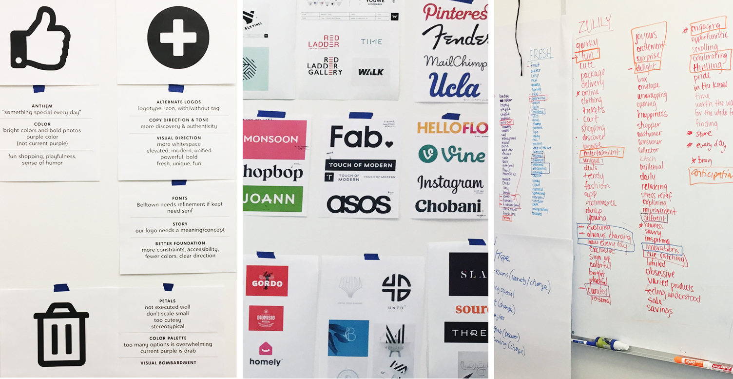
The first step in my process was to interview executive stakeholders to gage their likes/dislikes of the current identity, and most importantly, make sure everyone was on the same page about the goals of the rebrand. These answers would lay a foundation for the team. I included questions such as, What’s the story behind the brand? What adjectives do you want people to associate with Zulily? Who is the direct competitors? Why should our target audience choose to shop with us? What audience should we reach that isn’t currently a customer?
The next step was to interview my in-house design team to understand the pain-points of working with the current brand assets. The top complaints were the logo couldn’t fit in small spaces like an app icon or social profile image, and the color palette wasn’t restricted enough. The brand colors were soft and muted (originally based on a nursery color palette) and included almost every pastel color on the color wheel. This paralyzed designers because they had too many choices, and it meant every design was a unique approach to branding. This didn’t allow Zulily to have meaningful brand impact, recognition, or recall.
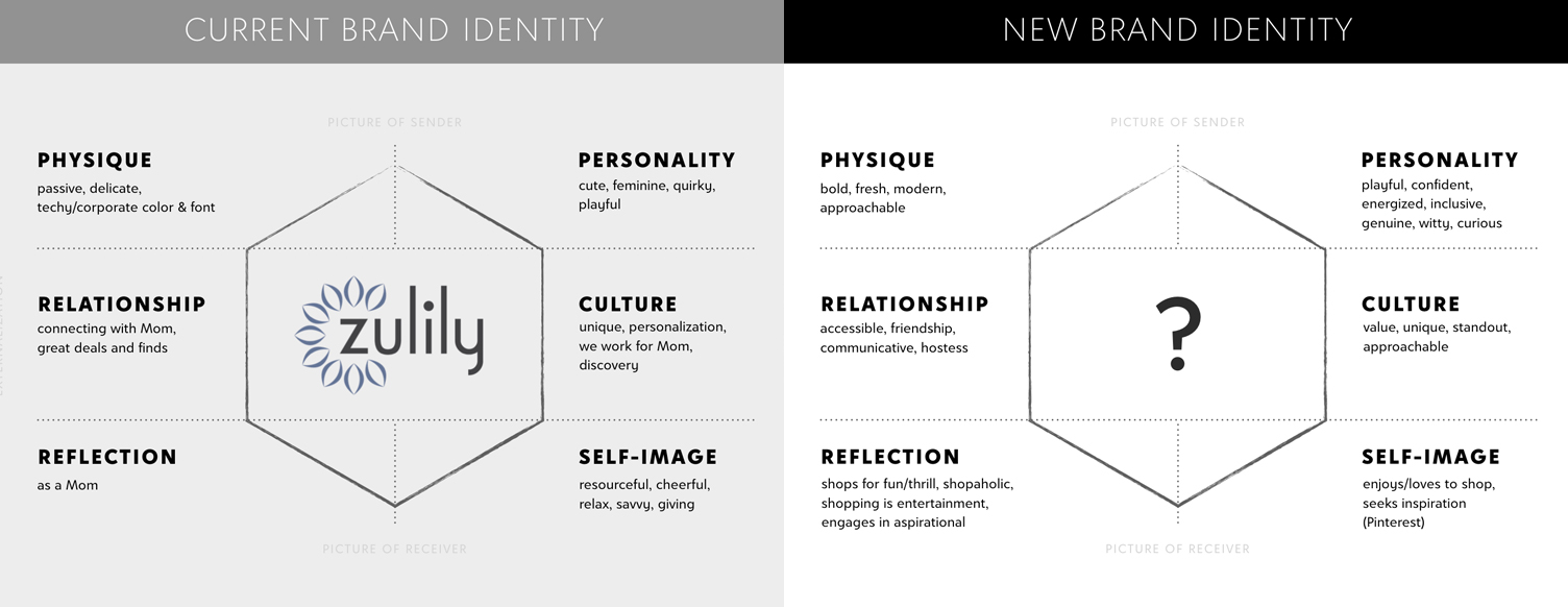
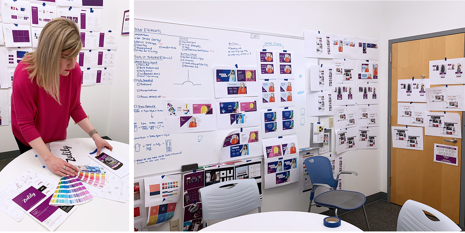
In order to complete the rebrand within six months, the copy and design teams worked in tandem for most of the process. The design team didn’t have the full foundation of brand traits or value props when we started, so the brand prism acted as our North Star. It helped us identify the difference between the current brand and where we needed to go.
The goals of the rebrand were starting to take shape:
-Increase brand awareness and recognition
-Own the idea that Zulily is a fun place to shop
-Align visual brand with new personality traits: confident, playful, energized,
LOGO DESIGN
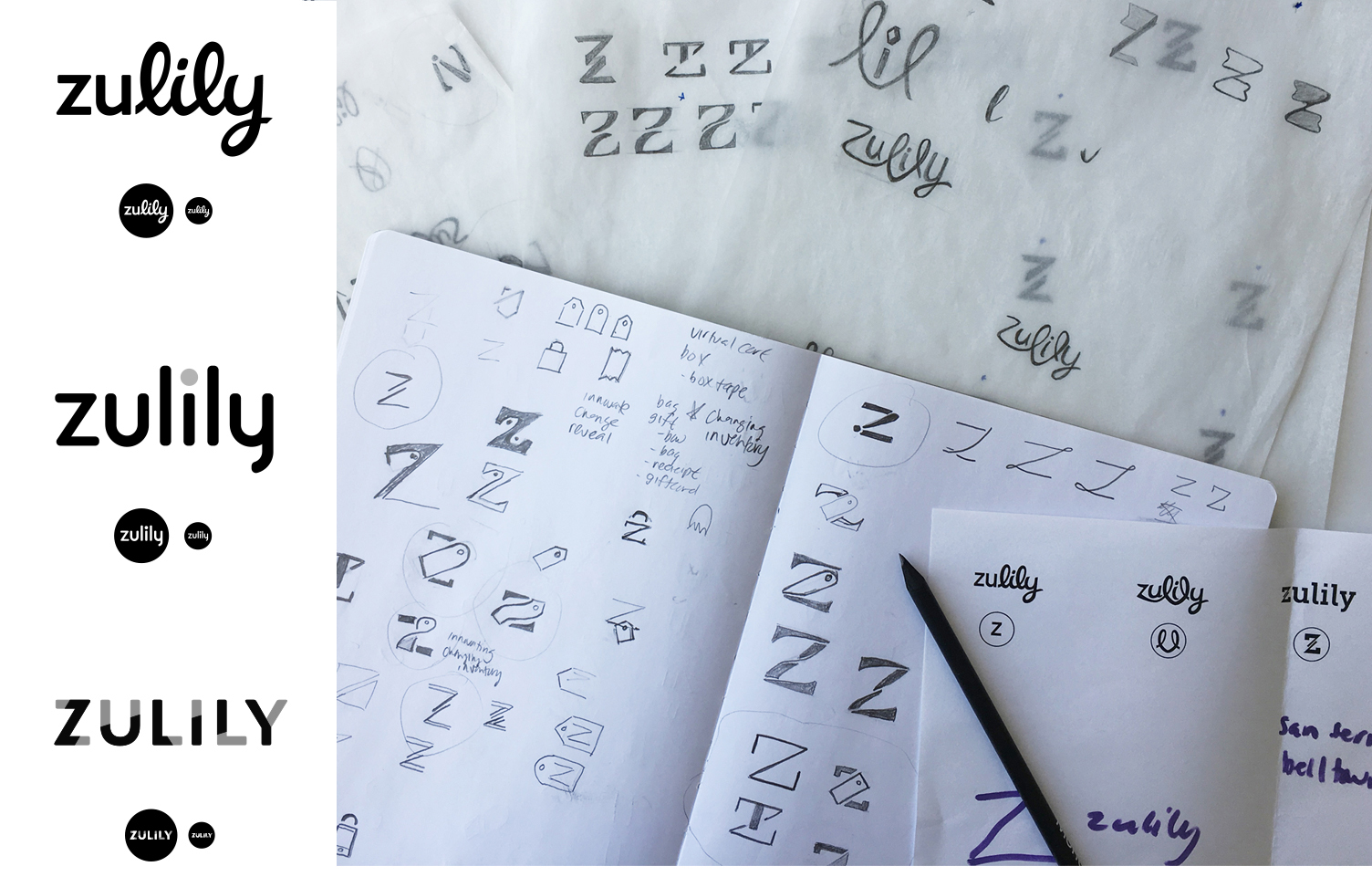
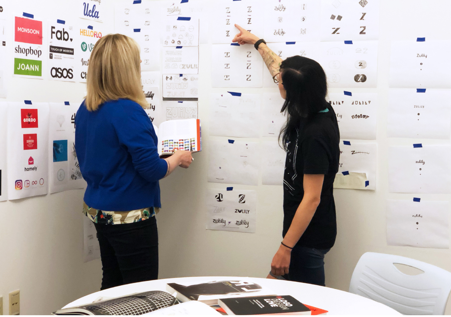
My designers and I researched, word-listed, and mind-mapped. Then we sketched, in the traditional pencil-to-paper sense. I had a pretty strict “no digital sketching” rule. Maybe that makes me old-school, but I believe in the science that says there’s a connection (and often magic) that happens between your brain and your pencil, and that step gets missed when you immediately jump on a computer.
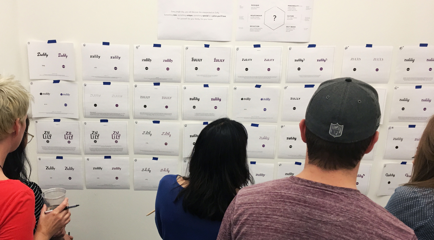
The first round of logos presented to the executive team didn’t have a clear winner, so for the next round the brand leadership team and I decided to take a new approach. Instead of going back to the same small, dedicated design team for another round, we opened the assignment to the entire design and UX team, plus an agency partner. They participated in a “Project Runway” style competition. Building on the initial strategy, designs, and feedback, designers had two weeks to submit their logo options. The other “judges” and I had no idea who submitted logos, so the voting was blind. We narrowed the logos to about five concepts along with the team favorite from the round one.
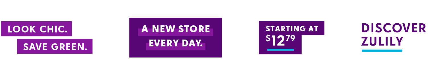
The final chosen logo, designed by Cynthia Oconer, was inspired by the script logos of Instagram and Pinterest. Zulily customers use these social channels for discovery-based shopping, so we wanted to remind the customer of that inspiration and fun experience. The script feels friendly and approachable, yet confident and unapologetic, and sets Zulily apart from the competition.
COLOR PALETTE
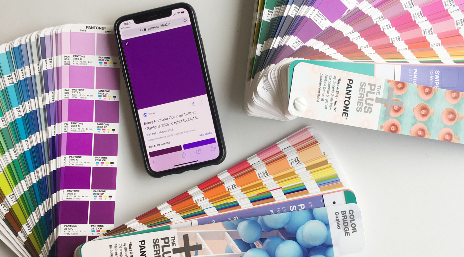
During the rebrand process, I had the privilege of training under Leatrice Eiseman, Executive Director of Pantone Institute, and becoming a certified color expert. I used my deepened knowledge of color psychology to guide me in choosing Zulily’s new color palette.
Current research on color theory was a major consideration, as well as, brand equity in the current colors, the competition, accessibility, and how consistent colors would appear between digital and print.
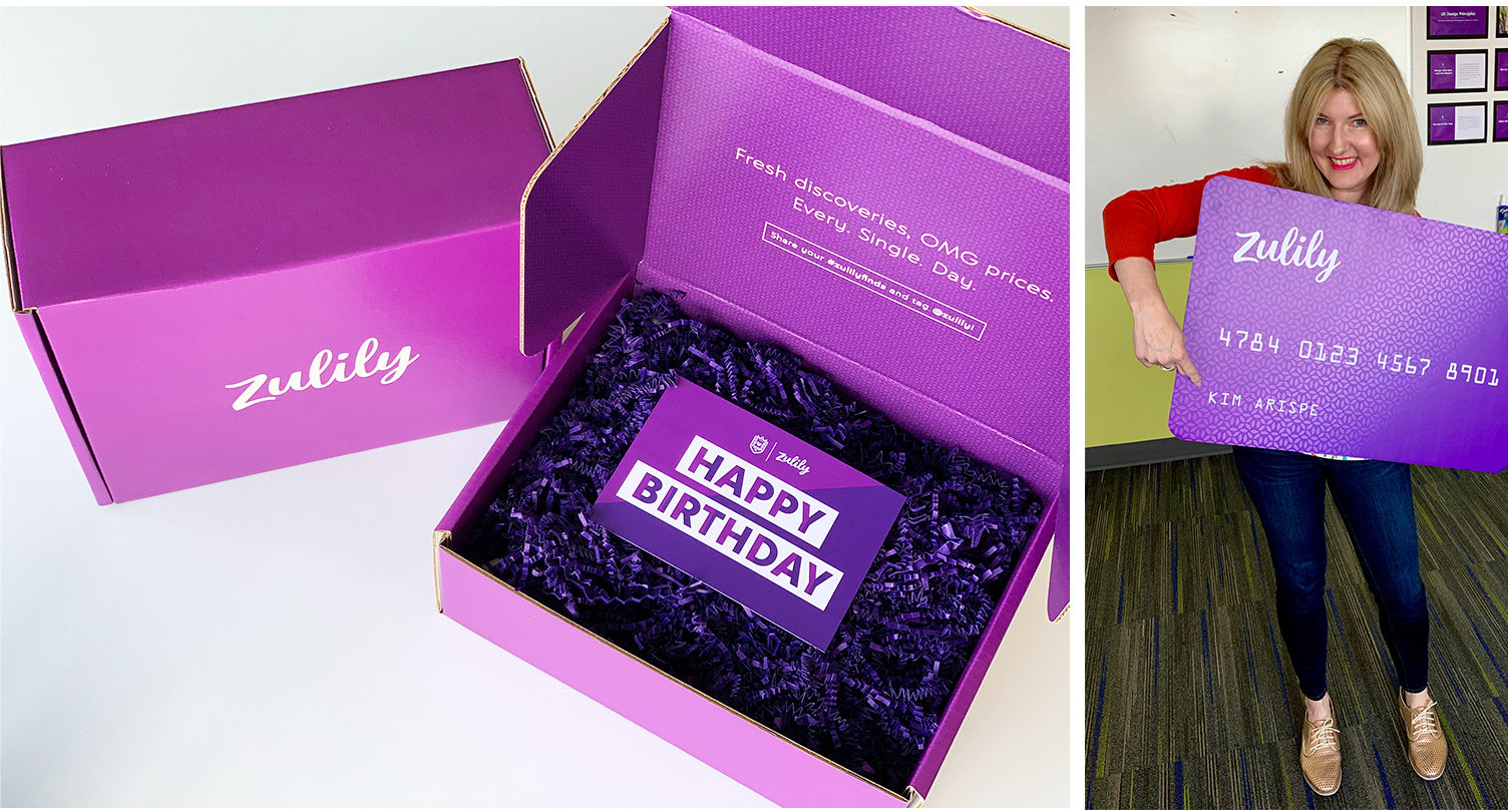
In order to tell a specific and distinct story, I developed a succinct palette with a dominant, secondary and three accent colors. Instead of referring to the colors as in Pantone numbers or hex code, I knew naming them would help communicate the meaning of each color, have an emotional impact on employees, and avoid confusion between designers and developers.
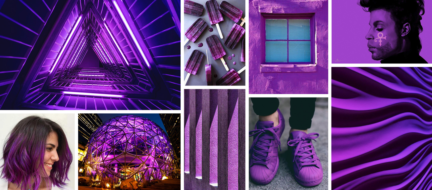
Discovery Purple
(Brand Equity, Innovation, Creativity, Excitement, Fun)
Discovery Purple builds on the brand equity Zulily had with the former pastel purple. The new, complex color gives a nod to a complex business model.The tone has been adjusted to a vibrant and powerful warm purple that expresses innovation, originality and visionary thinking—Zulily drives this vision & innovation through a unique shopping experience. Purple is known for creativity, and Zulily expresses this through on-trend products, curated events, and quirky finds.The warm undertone in the purple gets its characteristic from red, which creates a physiological response—it attracts the eye and excites the mind, creating a sense of exhilaration. This message of excitement, thrill, and fun is how customers feel when they find a must-have item at a great value.Discovery Purple will stand out on Zulily’s website, and in the competitive marketplace: Purple isn’t a common color in the retail market. Jet and Wayfair use purple but send a completely different color message, and most retail competitors use red, black, or blue.
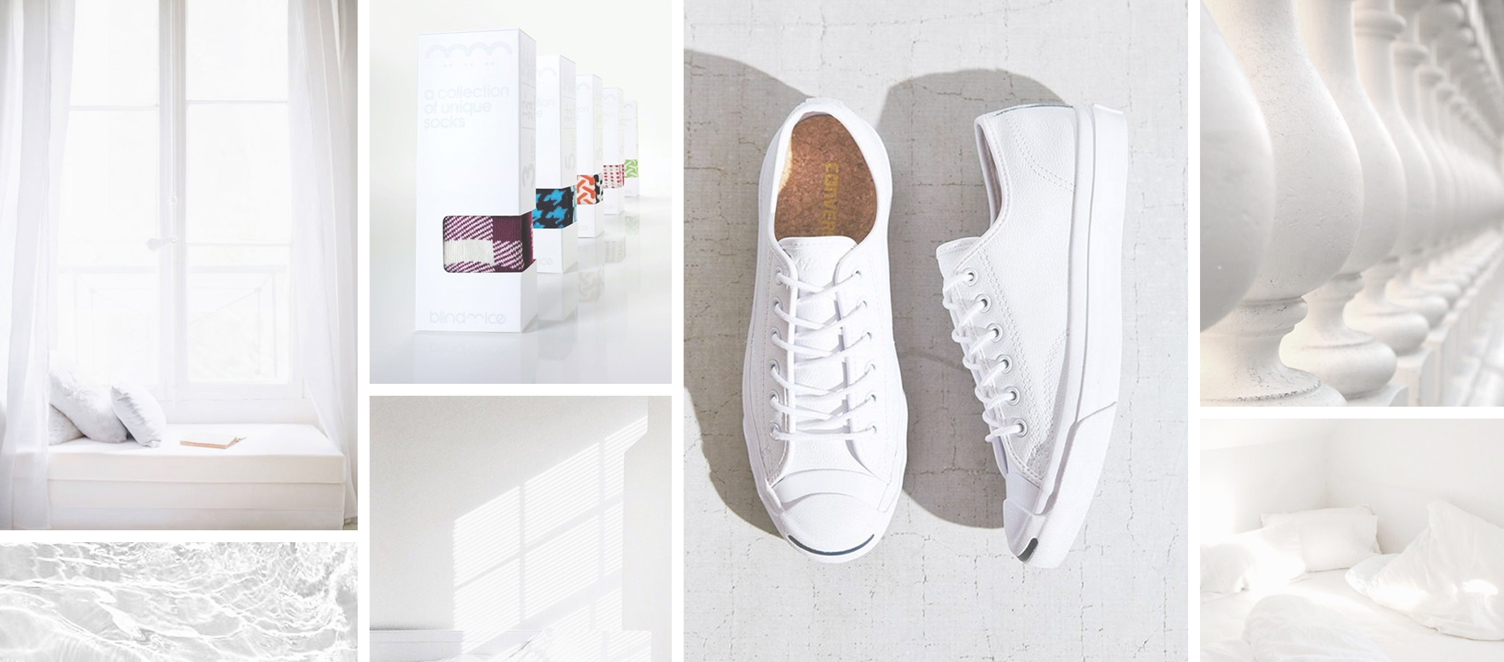
Smart White
(Clarity, Freshness, Balance)
For most people, the color white is associated with clean and refreshing. When paired with Discovery Purple, Smart White supports the dominant color without distraction, giving the excited eye a place to rest.Smart White lends a feeling of clarity to the very colorful shopping experience, resulting in harmonious balance. It allows site imagery to “take the lead” and carry the message.
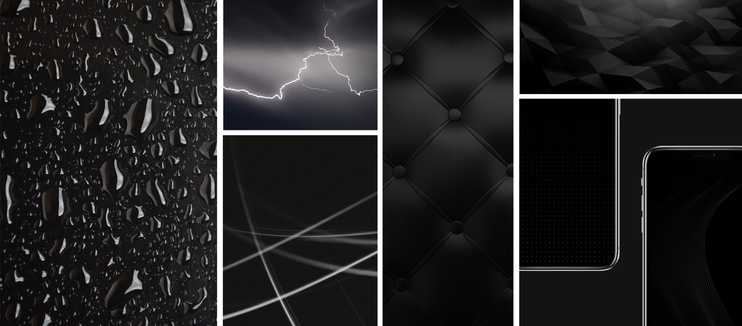
(Confidence, Sophistication, Power, Balance)
The color black is a favorite of consumers in all industries because it’s a classic, confident color that will never go out of style.The power and sophistication of Rich Black keep the more whimsical colors in the palette from feeling child-like. At the same time, it brings harmonious balance to Smart White.
(Empowerment, Intrigue + Innovation, Creativity, Excitement, Fun)
The palette calls for a darker, complementary color to add contrast and power. Adding too many new hues would fight the clean, calm balance established by Smart White, and it would dilute the meaning of the dominant color. Empowered Plum echoes the messages of Discovery Purple while adding a sense of intrigue.
Daybreak Blue
(Dependable, Credible, Calm, New Every Day)
Blue is embedded in our minds as a positive color because it’s linked to life-sustaining water, the dependability of the sky, and the symbolism of a new day. The messages of dependability and credibility build positive customer perception and inspire confidence in shoppers.The morning sky has cooler undertones than the warm evening sky. Thus we’ve chosen a cool blue, connecting our customer with Zulily’s “new every day” business model.Daybreak Blue’s cool undertone creates homeostasis with warm Discovery Purple. It also adds feelings of calm and happiness, extending the message of our Smart White.
COLOR STUDY
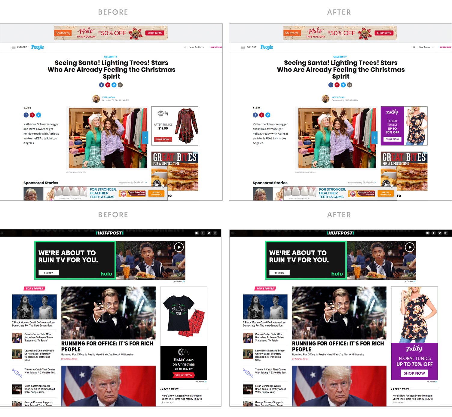
During the color vetting process, I recognized the need to educate leadership and the design teams about the impact color has on a customers’ purchase decisions and brand awareness. As an example, targeted ads had always been designed around the featured product, and the Zulily brand got completely lost. In order to explain the importance of embracing color ownership through the consistent use of one main, impactful color, I presented a comparison of current ads against ads using the new main color, Discovery Purple. The visual study showed that the new color and consistent approach would allow ads to get noticed, and in doing so aid in building brand awareness and recall.
TYPOGRAPHY
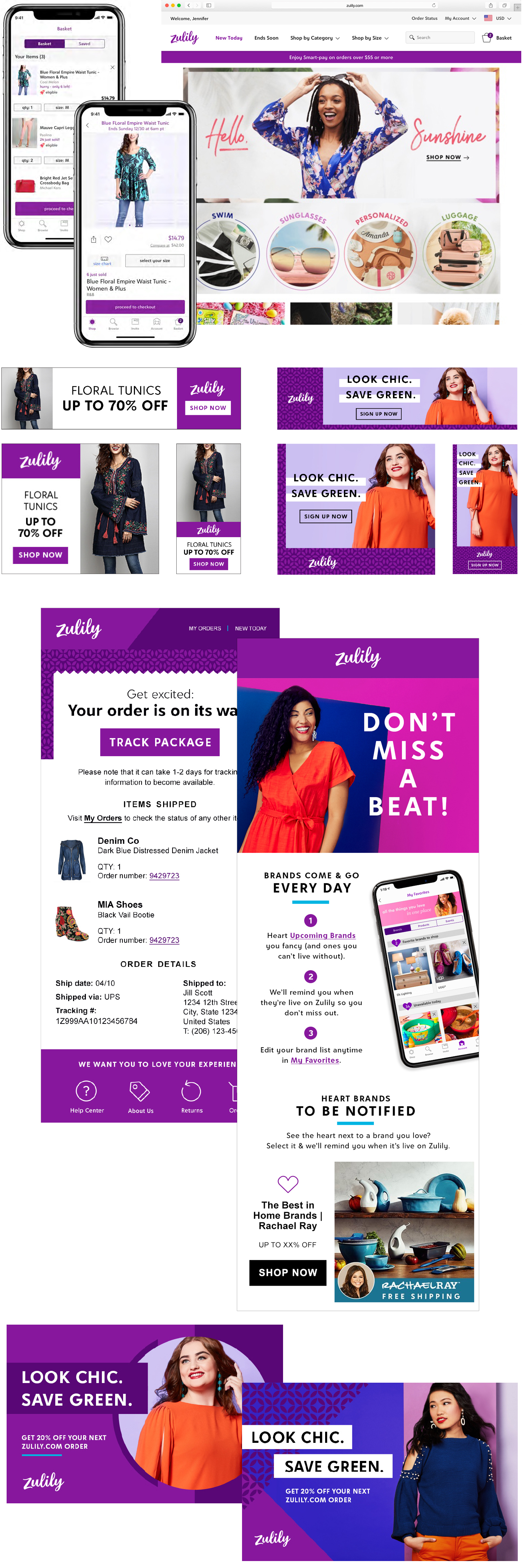
Zulily’s custom-designed font family, called Belltown, is named for the lively Seattle neighborhood where the home office is located. It’s loosely based on Futura, which was the brand font when Zulily first launched in 2010.Since the Discovery Purple color says Zulily is fun and playful, and the logo script is casual and whimsical, we needed to bring a hint of sophistication and balance to the visuals, so we chose to lead with headlines styled in all caps.
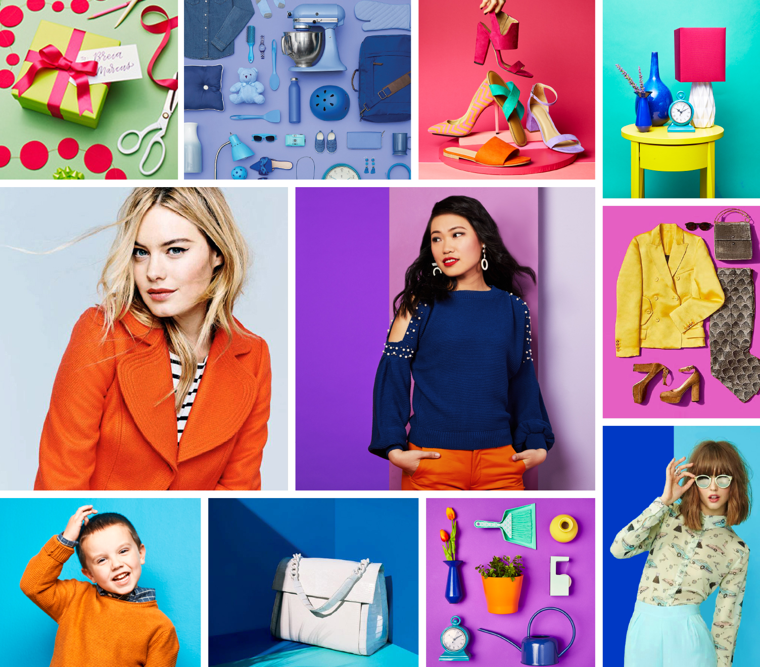
The initial photo mood board was created using some existing in-house photos and a few online-sourced images for inspiration and direction for the in-house photographers, stylists, and art directors. A second phase of the brand guide will focus on building out a robust photographic guide for lifestyle, product, and off-model shots.
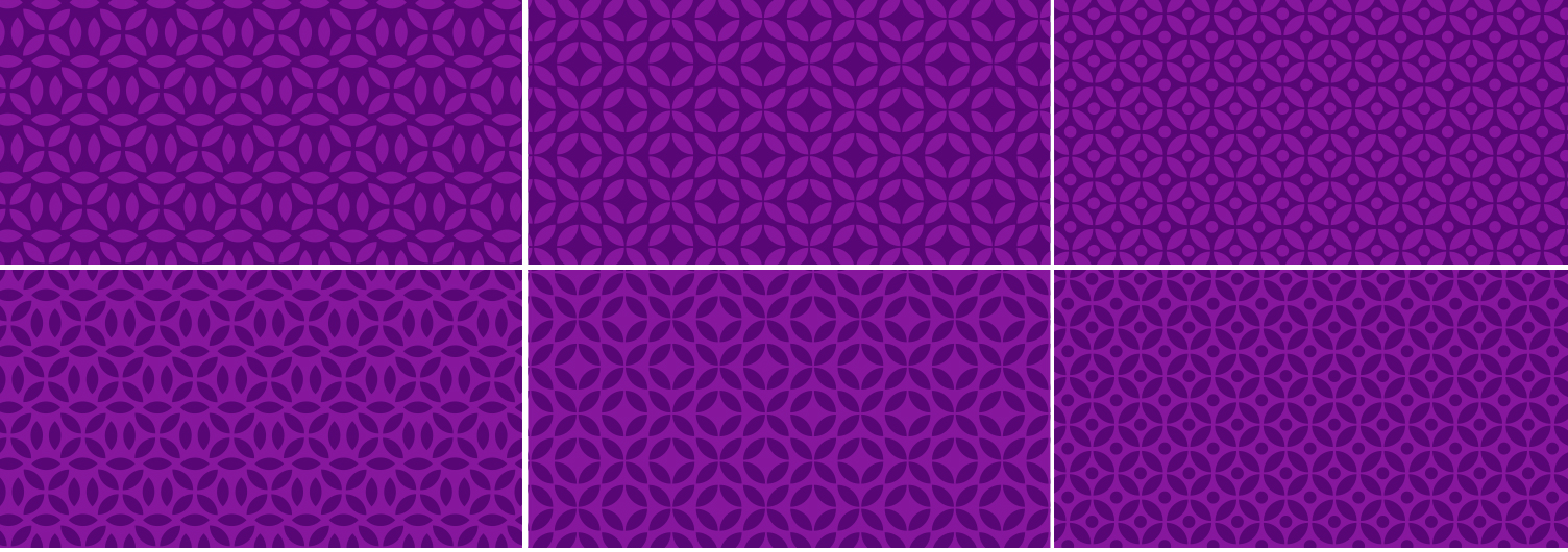
A series of patterns were created using the pedal shape from the old logo as a way of honoring and building on the original identity.
In order to move away from a kid-centric identity, the Zulily icons had to be revisited. The new icon set gave the site a sophisticated feel while still maintaining personality.
The team and I identified the need for a flexible design system that still retained maximum impact and brand recognition.In cases where there is minimal control over design—such as a templated, tool-based ad, or when a design calls for variable imagery—the layout should lead with the logo and Discovery Purple and remove other graphic elements that might clutter the space.
Because Zulily launches thousands of new products every day, the use of white space is extremely important within the site and app experience in order to reduce clutter, and allow these images to take the lead. I worked closely with the UX team on translating the new brand identity into the shopping experience.When the designer has complete creative control over the final execution, they can lean into additional branded elements such as styling the typography and adding patterns.
THE RELAUNCH
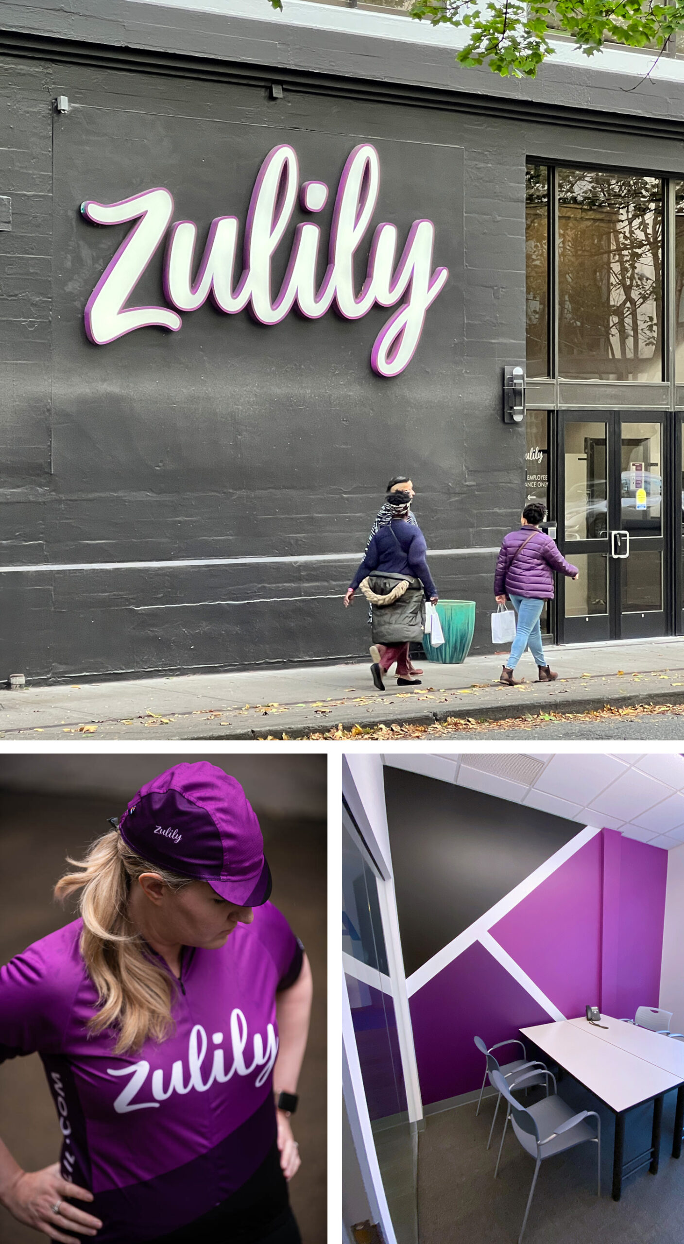
The logo, visual identity, and 70 page brand book took six months to complete from start to finish. Once the brand guide was passed off to the in-house design, copy, and UX teams, it took just two months to refresh hundreds of email, ads, and website placements. My favorite moments during the process was walking into the messy war room and feeling the energy of this new brand coming to life.
CUSTOMER RESPONSE
On the day of the Zulily site relaunch, many customers wrote in to say how much they loved the new look and shopping experience. One off my favorite quotes:“Big fan of the new @zulily branding! Bucks the trend of sans serif fonts in brandmarks and the bright, bold purple embodies the fun spirit of the brand in a way their old styling didn’t quite capture. Thumbs up from a regular customer!”